Skills
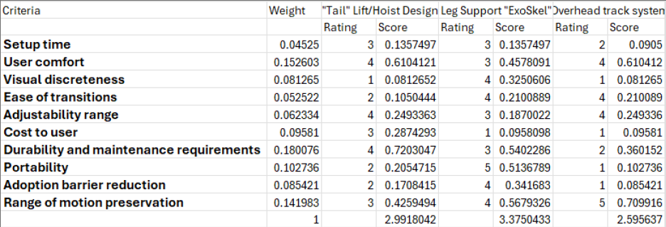
Decision Matrix
Summary
A decision matrix is a table based that uses the weights from your AHP table and the corelating criteria to decide how each design from brainstorming suites the problem. Using a rating system whether it's 1-5 or 1-10 etc, you rate each design for each criteria on how it best fits said criteria. Doing this lets us see how each design does in comparison with others and in comparison to the customers needs. This allows us to know which design meets the criteria the best and closet to the customers needs than just guessing.
My Decision Matrix
Design Brainstorm
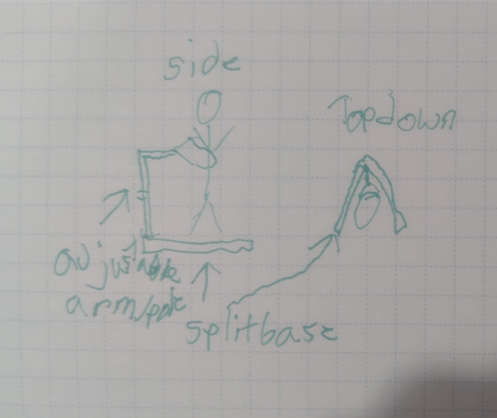
Design 1: "Tail" Lift/Hoist
This design would be like combing something like an engine hoist and like a "baby bouncer", the thing that helps babies stand. Essentially the base would be motorized and have a post coming off that attaches to the users waist to help with balance. This would also be able to "hoist" them up in case loss of leg movement etc so they can keep moving if in motion.
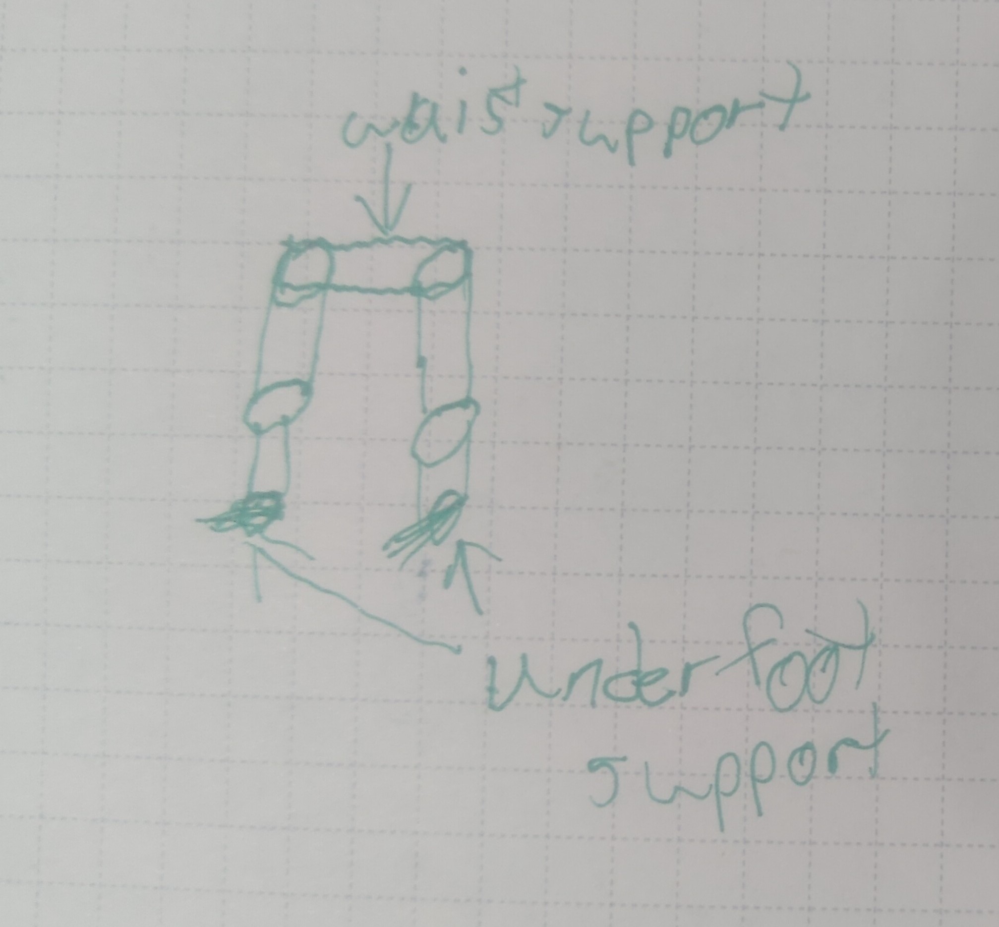
Design 2: Leg support "ExoSkeleton"
This design would be similar to an exoskeleton, but with the focus on leg support. The user would wear a frame that supports their legs, with bases under their feet, and has motorized joints to assist with movement. Allowing the user to essentially stand and walk with improved balance and would be able to "conceal" under bulky pants.
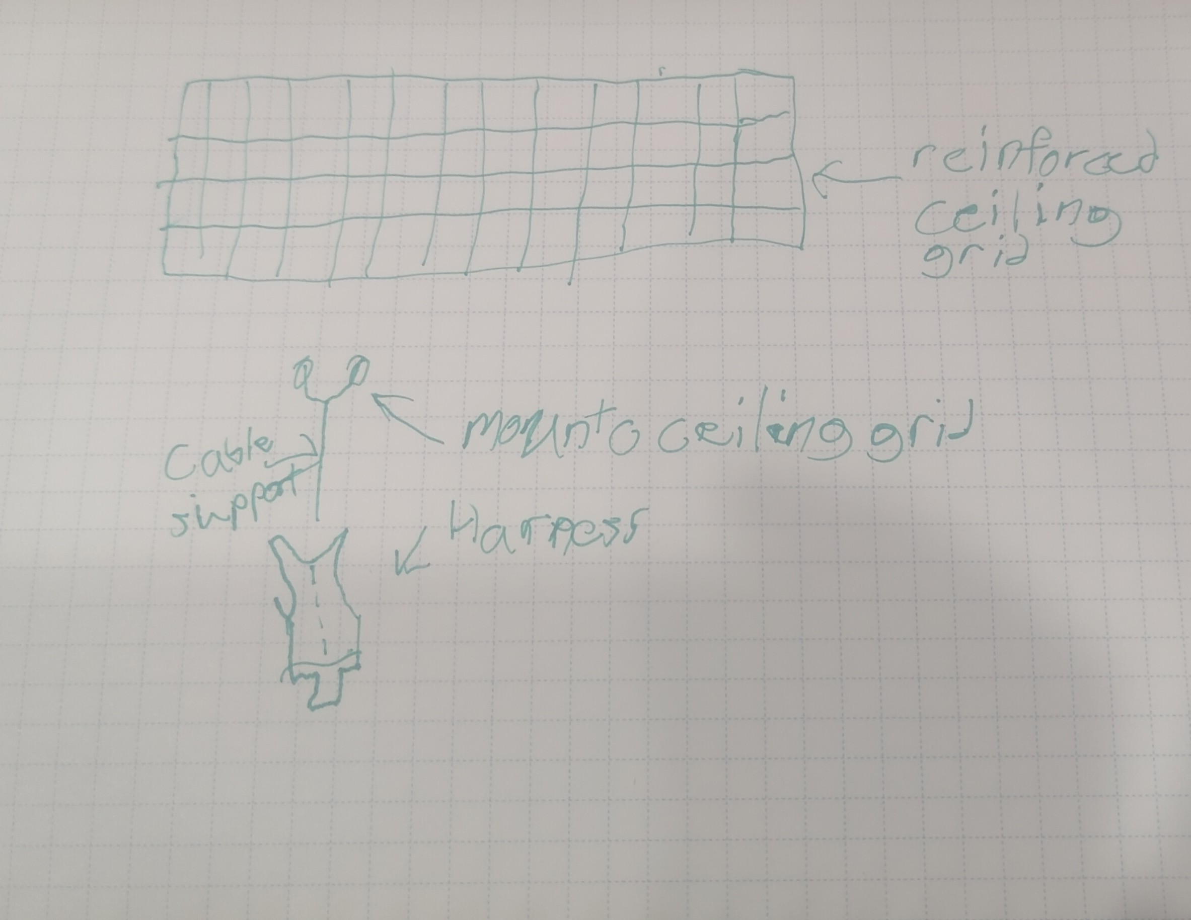
Design 3: Overhead Track System
This design would involve adding an overhead track system in areas the user frequents. The user would wear a harness that connects to a motorized trolley on the overhead track, allowing them to move around with ease and stability. This system would be ideal for environments like homes or workplaces where the track can be installed.
Overall, creating the decision matrix helped me objectively evaluate each design against the criteria that matter most to the user. It highlighted the strengths and weaknesses of each option, making it clear which design best meets the user's needs. This structured approach to decision-making is invaluable in engineering design, as it reduces bias and ensures that choices are based on data rather than intuition alone.
From my interviews and research, a big priority is comfort and low cost while still allowing the user to stand for long periods of time like they could before Parkinson's. Another issue is movement sometimes fails due to the nature of the disease, so having a design that could do both and be comfortable to the user is key. Looking at the decision matrix, the leg support exoskeleton scored the highest, mainly due to its balance of comfort and mobility support. This design seems to best align with the user's needs and constraints identified earlier in the project.
CAD Models
My Prototype
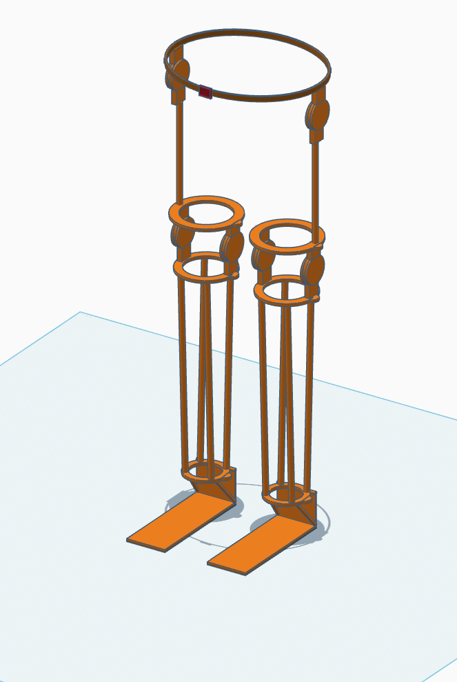
Design Summary
The solution is a lower "exoskeleton". It has supports under the feet to not only support itself, allowing the user to not have to bear the weight, but also helping the user with balance. As you go up there's a joint and supports at the ankle to still allow the ankle to bend within limit to keep user balance and help them stay vertical when muscle gives out. The knee area features what would be a spring joint allowing the user to bend their knee to walk or sit while still holding them up so they could stand for long periods. There is a similar joint at the hip where it connects to a belt for ease of adjustment and motion. I'd imagine the vertical rods being made out of something like carbon fiber or similar composites for rigidity while keeping it light. The foot base would need to be a steel or titanium to not flex or shear under load/use. The mount locations up the leg could be a reinforced plastic (PETG or similar) as they are not as high stress as the foot, but still need to be rigid. Then the supports and joints would need to be pneumatic so they can lock out movement to keep the user standing and then be able to flip a switch and have assisted walking.
Experience using CAD
Overall, the software was easy to use and pretty straight forward. I feel the technology benefits the design process by allowing faster and more accurate prototyping and allows for less physical iteratives allowing costs to stay down. It was fairly easy to learn, I use Fusion 360 for personal projects so going from sketch based to object based was interesting and took a second, but it's easy to pick up once I got used to starting with a shape instead of sketch. I used the most of the features in TinkerCAD starting with duplicate the most then grouping, snapping/aligning, and the scaling and typing my sizes and distances in right behind that. It didn't change much the biggest change was just being able to have more accurate measurements to scale better so the model is mor proportionate to what it would be in reality. I was able to depict majority of it in the model the only parts not depicted would be wiring harnesses and the electrical side along with more advanced detailing of specific supports and joints.
Using CAD in the Future
In the future I will use these skills to create more detailed prototypes and iterate on designs faster. I can also use it to create models for 3D printing to create physical prototypes. I will also use it for helping visualize more of my ideas to push them to reality and to be able to share them with others. I can also use it to create more detailed models for presentations and reports to better communicate my ideas and designs.
Project Management
Gantt Charts
A Gantt chart is a type of bar chart used in project management to visually represent a project's schedule over time. Each horizontal bar corresponds to a specific task or activity, with the bar's left edge marking the task's start date and its right edge marking the planned completion date. The chart is laid out on a shared timeline so that anyone on the team can immediately see which tasks are running in parallel, which ones must finish before others can begin, and where the major milestones fall across the project. Originally developed by Henry Gantt in the early 1900s, the format remains one of the most effective planning tools in engineering and industry because it converts an abstract schedule into a single readable visual, forcing the team to think through the full scope of work, estimate realistic durations, and identify dependencies before execution begins.
During active project work, a Gantt chart functions as a live tracking tool, not just a planning artifact. As work progresses, the chart should be reviewed at each milestone to compare actual progress against the baseline schedule. If a task slips, the chart makes the downstream impact immediately visible, showing which later tasks are at risk and by how much. This early-warning capability allows the team to make proactive adjustments such as reallocating effort, narrowing scope, or accelerating parallel tasks before a small delay cascades into a missed final deadline. Revisiting the chart regularly also creates accountability: it is harder to rationalize falling behind when the schedule and its consequences are displayed in front of you.
My Gantt Chart
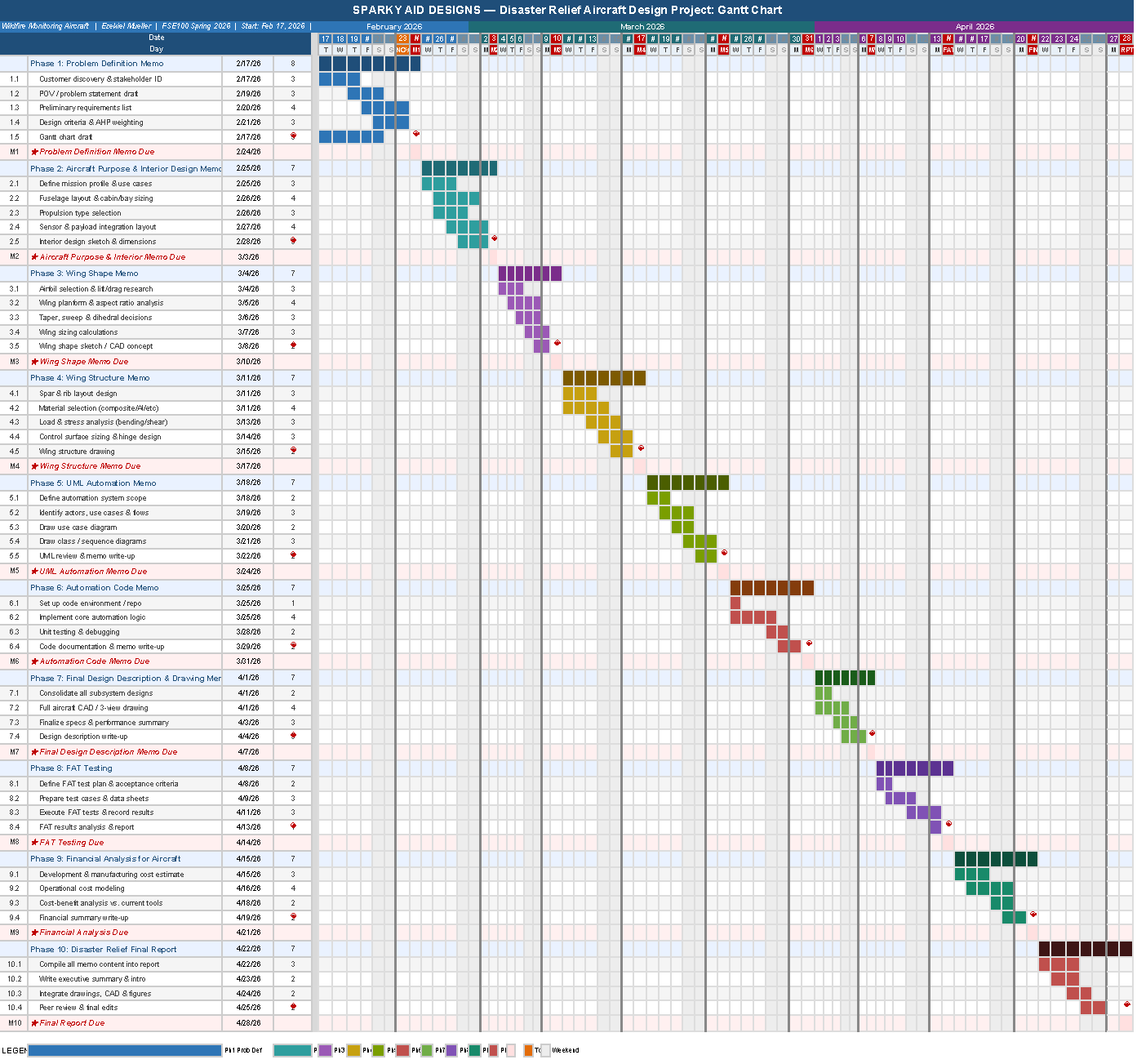
The Gantt chart for this project spans February 17 through April 28, 2026, a 71-day window divided into ten phases. Each phase is anchored to one required deliverable: the seven memos (Problem Definition, Aircraft Purpose and Interior Design, Wing Shape, Wing Structure, UML Automation, Automation Code, and Final Design Description and Drawing), followed by FAT Testing, Financial Analysis for the Aircraft, and the Final Report. Within each phase, four to five specific work tasks break the deliverable down into research, analysis, drafting, and review activities. Each time block represents a single calendar day. A daily resolution was chosen because the deliverable cadence is weekly, making days the natural unit of precision, a weekly resolution would collapse too much detail and make it impossible to see whether preparation starts early in the week or the night before the deadline.
The longest phase by calendar span is Phase 10 (Final Report), which covers the last seven days of the project and requires compiling all prior deliverable content into one cohesive document. In terms of sustained technical effort, Phase 7 (Final Design Description and Drawing) is the most demanding memo phase because it requires integrating all prior subsystem decisions, fuselage layout, wing geometry, structural analysis, and automation architecture, into complete drawings and a unified design narrative. Milestones are marked with a diamond (◆) at the end of each phase and represent the Monday midnight Arizona time deadline for each deliverable. If I fall behind schedule, my plan is to identify which specific task slipped, then either narrow the scope of that memo's analysis sections to focus on the most critical design decisions, or start the following phase's research tasks earlier in the prior week to buy back time without compressing the drafting window.
Potential Risks
Risk 1: Technical Complexity Underestimation
Several later phases, particularly Wing Structure, UML Automation, and Automation Code, require technical depth in structural mechanics, software architecture, and systems modeling that may take significantly longer to research and execute than initially estimated. If the complexity of any of these phases is underestimated, work could spill into the following week's preparation window and create a cascading delay. To mitigate this, I will begin preliminary research for each phase at least two days before the prior deliverable is due. For highly technical phases, I will set a personal rule that a first draft must exist by Friday so Saturday and Sunday are available for revision rather than initial writing. If a topic proves intractable, I will consult course resources early in the week rather than persisting independently past a reasonable threshold.
Risk 2: Competing Academic and Professional Obligations
As a part-time student who also works professionally as a videographer and drone operator, high-demand weeks in courses, major assignments, or large field shoots could compress the available time for project deliverables. Weeks with exam stacks or scheduled large-format drone operations represent a particular concentration of risk. To mitigate this, the Gantt chart has been deliberately front-loaded so that research tasks begin early in each weekly window rather than the day before the deadline. Work on project tasks will be scheduled in my calendar alongside other commitments so that conflicts are visible at least a week in advance, and professional assignments that overlap with milestone weeks will be flagged and adjusted where possible.
Risk 3: Design Iteration Forcing Rework of Prior Deliverables
Aircraft design is iterative. A decision made in the Wing Shape memo could expose a structural incompatibility that requires revisiting the interior layout from the prior phase. Similarly, the automation code phase may reveal that the UML architecture doesn't map cleanly to an implementable system, requiring redesign. Because each memo builds on prior work, a significant design revision discovered late could force rework across multiple already-submitted deliverables and destabilize the schedule. To mitigate this, each memo will include a brief forward-compatibility check at the end of the drafting task, a quick review asking "what does this decision constrain in the next phase?", to catch interdependency conflicts before they are locked into a submission. Design choices will be documented with explicit assumptions so that if a downstream phase forces a change, the scope of rework is clearly bounded.
UML Modeling
Use-Case Diagram
A use-case diagram is a behavioral UML model that captures the functional requirements of a system by showing the interactions between actors (people or external systems) and the use cases (actions or services the system provides). Each oval represents a discrete capability; lines connect actors to the capabilities they can invoke. The system boundary, a labeled rectangle enclosing all use cases, makes it immediately clear what is inside versus outside the scope of your design.
For a designer, use-case diagrams are indispensable early-stage tools. They force you to answer three questions before writing a single line of code or drawing a floor plan: Who are the stakeholders? What do they need to do? What falls outside our responsibility? This prevents scope creep, reveals missing requirements, and creates a shared vocabulary between engineers, clients, and non-technical stakeholders.
For Forge & Ember, an upscale open-hearth restaurant where guests watch their protein cut, fire-seasoned, and plated at a live wood-burning forge station, I used the use-case diagram to map every category of participant (guest, server, kitchen, management, delivery partner, and system kiosk) against every discrete interaction the concept demands. The diagram immediately surfaced a non-obvious requirement: the forge station cook is a distinct actor from the line cook, because guests interact directly with the forge cook during the "theatric plating" experience.
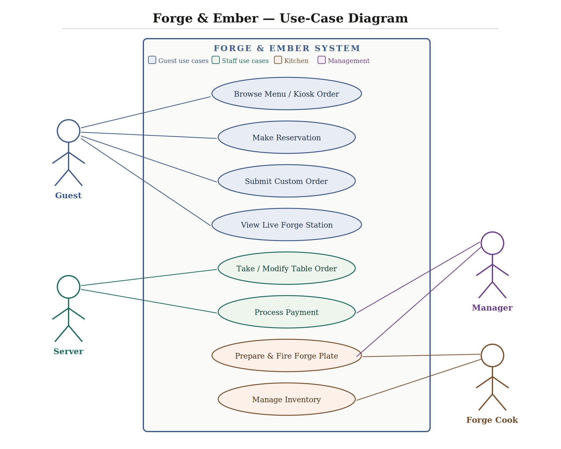
The Forge & Ember system has five primary actors. The Guest is the central patron who interacts with the most use cases: they can browse the menu (via physical menu or touchscreen kiosk), make a reservation, submit a customized order with protein and char level, and observe the live forge station as part of the dining theater. The Server manages the table experience, taking and modifying orders verbally, coordinating with the kitchen, and processing payment through tableside POS terminals. The Forge Cook is a specialized kitchen actor unique to this concept: they prepare, fire, and plate at the open hearth and interact directly with the inventory system. The Manager oversees reporting and inventory thresholds but does not interact with the guest-facing ordering system directly. Finally, the Kiosk/POS System is an automated actor enabling self-ordering at entry, reducing server bottlenecks during peak hours.
The overall interactions cluster into three zones: front-of-house (reservation, ordering, payment), back-of-house (food preparation, inventory), and management (analytics, supply chain). When designing for all five actors simultaneously, we must account for overlapping touchpoints, particularly the handoff from kiosk ordering to the kitchen display system, which both the Forge Cook and line cook depend on.
Sequence Diagram
A sequence diagram is a UML interaction diagram that shows the chronological order of messages exchanged between actors and system components. Time flows downward; each participating entity has a vertical "lifeline," and horizontal arrows between lifelines represent messages or method calls. Optional activation boxes (rectangles on the lifeline) denote periods during which an object is actively executing. Return messages are typically dashed to differentiate response from invocation.
Sequence diagrams are essential for validating that a system's logic is sound before implementation begins. They make latency and bottlenecks visible, if one actor has too many serial messages, that is a design smell. They also surface integration requirements: every arrow crossing a boundary between two systems implies an API contract that must be specified.
For Forge & Ember, I traced the full path from a guest sitting down to food reaching the table. The diagram revealed a critical design choice: the system must decouple the order confirmation (returned to guest immediately) from the kitchen ticket generation (asynchronous), so a slow kitchen display printer does not block the POS from accepting the next table's order. It also showed that the Forge Cook needs a separate display from the line cook, since they execute different preparation steps in parallel.
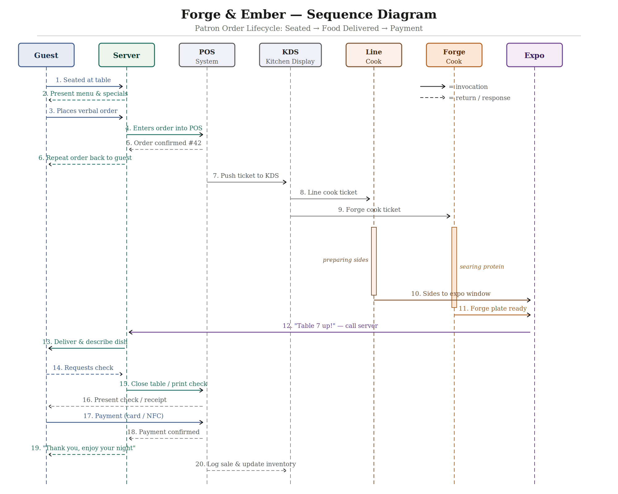
The sequence involves seven actors. The Guest initiates and terminates the transaction. The Server is the human intermediary—translating verbal requests into system inputs and delivering the finished product. The POS System is the central digital hub that validates the order, generates confirmation numbers, and bridges front-of-house to kitchen. The KDS (Kitchen Display System) receives and routes tickets, separating them by station to prevent a single cook from being overwhelmed. The Line Cook and Forge Cook execute in parallel—sides and protein fire simultaneously, and both report readiness to the Expo (Expeditor), who assembles the final plate and calls the server. The chain of command is: Guest → Server → POS → KDS → Kitchen → Expo → Server → Guest. The payment loop then closes: Guest → POS → Server → Guest. Two systems (POS and KDS) enable every human-to-human handoff, which is the core design insight: digital systems remove ambiguity from the three most error-prone moments in a restaurant, order transmission, kitchen routing, and payment.
Activity Diagram
An activity diagram is a UML behavioral diagram that models the flow of actions, decisions, and parallel activity within a process. It resembles an enriched flowchart but has formal semantics: filled circles mark start nodes, a bullseye marks the end, diamonds are decision points, horizontal bars denote forking and joining of parallel threads, and rounded rectangles are activity nodes. Guards, boolean conditions, label each outgoing edge from a decision diamond, ensuring that every path is accounted for and mutually exclusive.
Activity diagrams are particularly useful for modeling human decision-making, because human behavior branches constantly and often loops. They make implicit decisions explicit: a process you perform automatically every Friday night turns out to involve eight or more distinct decision points when diagrammed rigorously. For designers, this is valuable because it reveals which paths are most common (optimize those for friction reduction) and which are dead ends (safeguard against them).
For the Friday night dinner decision, I traced every fork from the initial "I'm hungry" moment through the final eating event, accounting for social context (eating alone vs. with others), budget, mood for cooking vs. going out, cuisine preferences, and the very real scenario of indecision leading to ordering delivery as a fallback.
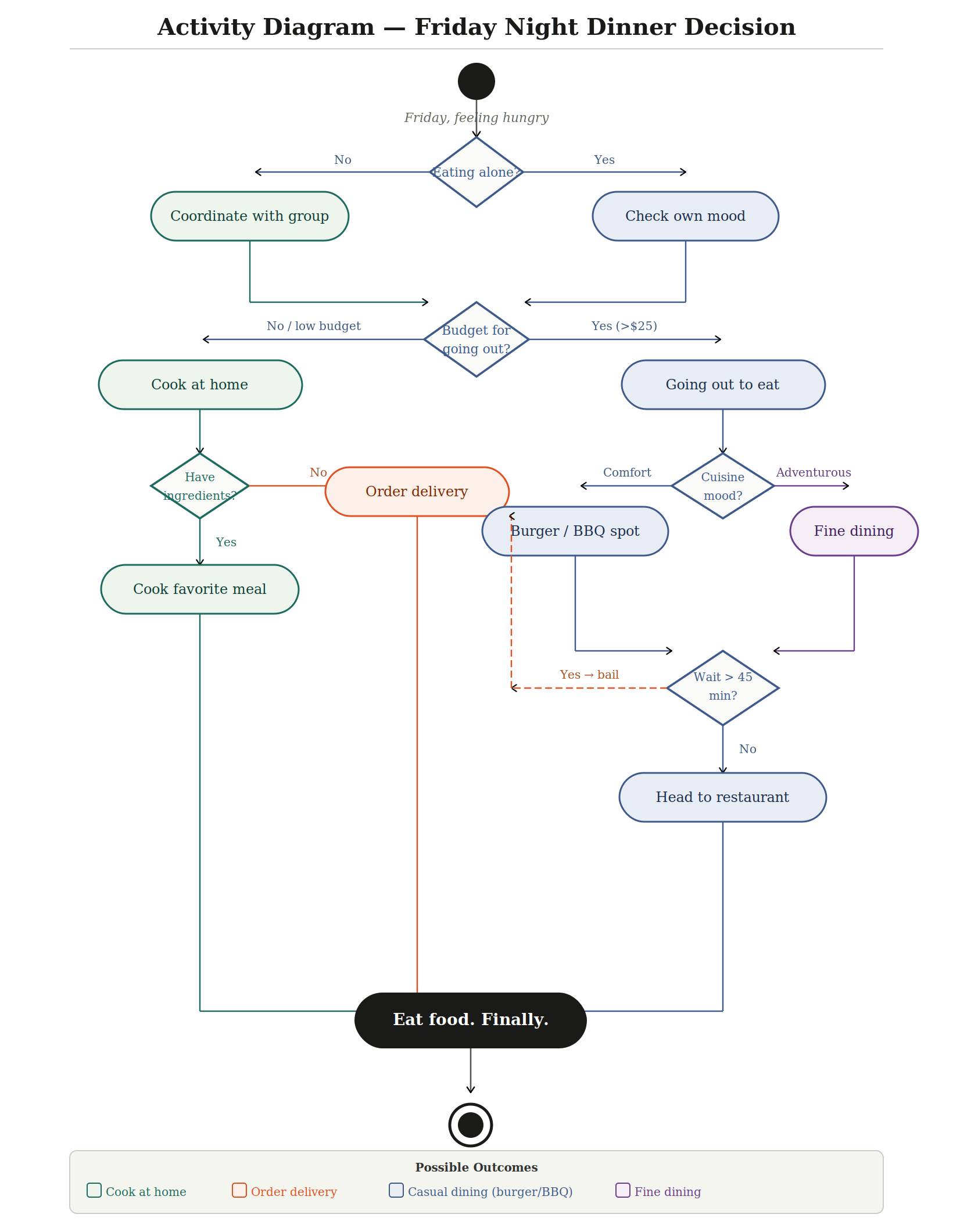
The activity diagram produces four distinct outcomes, each reached by a different routing through the decision tree. Path 1 Cook at home: triggered when budget is low AND ingredients are available; leads directly to preparing a home meal. Path 2 Order delivery: the most common fallback, triggered either by lack of grocery items at home or by a restaurant wait time exceeding 45 minutes; this path is reached from two separate points in the diagram, reflecting how frequently delivery becomes the pragmatic choice. Path 3 Casual dining (burger/BBQ): reached when budget permits going out and mood leans toward comfort food, with an acceptable wait time. Path 4 Fine dining: reached when budget permits and mood is adventurous, also contingent on an acceptable wait. The key decision variables are: social context (alone or group), available budget, pantry state, cuisine preference, and wait tolerance. The two most significant forks, budget and wait time, are the ones most likely to redirect the entire flow, which means a restaurant that manages reservations well and prices accessibly is competing for the largest share of this decision space.
Reflection on UML Modeling
Working through these three diagram types was a genuinely clarifying experience. The process of externalizing implicit knowledge, systems I interact with daily but had never formally modeled, revealed structural assumptions I had never examined. The sequence diagram in particular forced me to acknowledge that the restaurant I had envisioned relies on at least two software systems (POS and KDS) as load-bearing components: remove either, and the human chain of command collapses. I now see UML not as documentation generated after a system is built, but as a thinking tool that validates whether a design is coherent before any resource is committed.
I will absolutely incorporate UML diagrams more intentionally going forward, particularly when planning software systems, workflows, or any project with multiple interacting parts. The activity diagram in particular changed how I think about decision-making processes, what feels like a simple Friday night choice turned out to involve eight distinct decision points when modeled rigorously. The hardest part of this exercise was resisting the temptation to show everything and instead practicing the discipline of abstraction, choosing the right level of detail for each diagram type. That constraint is, I think, the most transferable skill here: engineers must model interactions before designing features because a diagram is far cheaper to revise than a finished system, and catching a missing requirement on paper is vastly less costly than discovering it in production.
Automation Code
Summary of automated feature:
The automated feature I built for the Cessna 208B Grand Caravan EX is the Wildfire Thermal Boundary Detection and Alert System (WTBDAS). The purpose of this system is to monitor two critical flight hazards during long-endurance fire perimeter surveillance missions, dangerously high ground surface temperatures indicating proximity to an active fire, and inadvertent low-altitude flight below the minimum safe standoff distance of 500m AGL. This feature is important because a pilot simultaneously managing navigation, radio communications with ground incident commanders, and sensor payload monitoring is cognitively overloaded and may not react quickly enough to a sudden thermal spike or altitude loss. Automating this detection removes a critical point of human error and reduces the risk of aircraft loss. The code makes five decisions every 500 milliseconds: whether ground temperature exceeds 250°C (critical), whether it falls between 200°C and 250°C (warning), whether temperature is normal, whether altitude has dropped below 500m AGL, and whether altitude is normal. The TMP36 temperature sensor triggers a yellow LED and short beep at the warning threshold, and switches to the red LED with a continuous 2000Hz alarm plus a serial FMS waypoint command at the critical threshold. The potentiometer altitude sensor triggers the red LED and a higher-pitched 2500Hz continuous alarm when the simulated altitude drops below 500m AGL, along with a serial FMS climb command. Both sensors are polled independently every loop cycle so they can trigger simultaneously if both hazards are present at the same time.
My Circuit Design
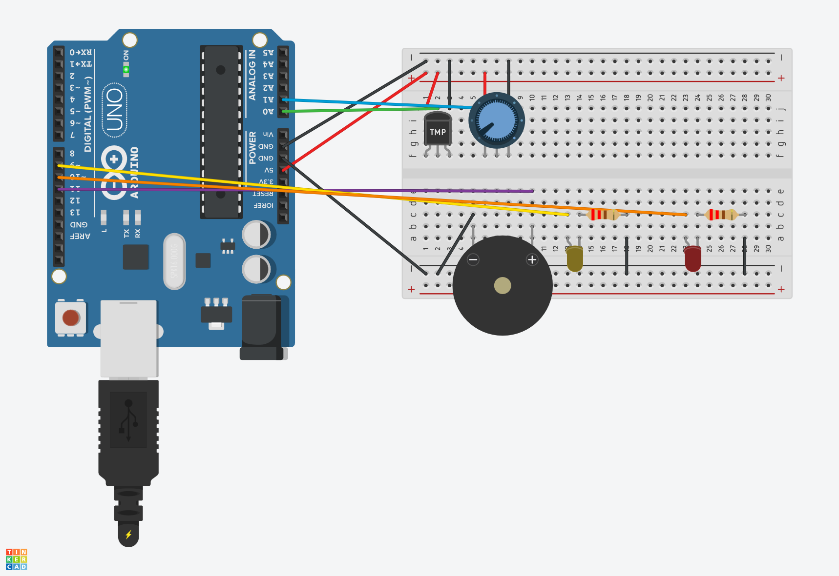
Circuit input/output summary:
The two input sensors are the TMP36 analog temperature sensor (connected to analog pin A0), which simulates the MLX90614 infrared ground thermometer that would be used in the real aircraft system, and the 10kΩ potentiometer (connected to analog pin A1), which simulates the BMP280 barometric pressure altimeter. The three output components are the yellow LED with a 220Ω current-limiting resistor (digital pin 9), the red LED with a 220Ω current-limiting resistor (digital pin 10), and the piezo buzzer (digital pin 11). References: TMP36 wiring and analog read approach referenced the Arduino built-in example "AnalogReadSerial" at arduino.cc/en/Tutorial/BuiltInExamples/AnalogReadSerial. LED resistor values calculated using standard practice documented at docs.arduino.cc. TMP36 voltage characteristics referenced the Analog Devices TMP36 product datasheet.
My Automation Code
// Pin definitions
const int TEMP_PIN   = A0;  // TMP36 temperature sensor input
const int ALT_PIN    = A1;  // Potentiometer altitude sensor input
const int YELLOW_LED = 9;   // Yellow warning LED output
const int RED_LED    = 10;  // Red alert LED output
const int BUZZER_PIN = 11;  // Piezo buzzer output

// Threshold constants (integer to match map() output)
const int TEMP_YELLOW   = 200;  // Yellow alert threshold (scaled degrees C)
const int TEMP_RED      = 250;  // Red alert threshold (scaled degrees C)
const int ALT_THRESHOLD = 512;  // Below this raw reading = altitude warning

// Timing constants
const int LOOP_DELAY = 500;  // Polling interval in milliseconds

void setup() {
  // Initialize output pins as outputs
  pinMode(YELLOW_LED, OUTPUT);
  pinMode(RED_LED,    OUTPUT);
  pinMode(BUZZER_PIN, OUTPUT);

  // Initialize all outputs to off state
  digitalWrite(YELLOW_LED, LOW);
  digitalWrite(RED_LED,    LOW);
  noTone(BUZZER_PIN);

  // Start serial monitor — simulates FMS data bus and event log
  Serial.begin(9600);
  Serial.println("WTBDAS system initialized.");
  Serial.println("Monitoring thermal conditions and altitude AGL.");
  Serial.println("---------------------------------------------");
}

void loop() {

  // SENSOR 1: Read TMP36 temperature
  // Raw reading 0-1023 mapped to 0-400 scaled degrees C
  // TMP36 in Tinkercad outputs max raw value of ~357 at 125C
  // Mapping 0-357 to 0-400 exercises full alert threshold range
  int rawTemp = analogRead(TEMP_PIN);
  int tempC   = (int)map(rawTemp, 0, 357, 0, 400);

  // SENSOR 2: Read potentiometer altitude
  // Potentiometer right = low altitude, left = high altitude
  // Raw 1023-0 mapped to 0-1000m AGL
  // ALT_THRESHOLD at raw 512 = 500m AGL boundary
  int altReading = analogRead(ALT_PIN);
  int altMeters  = (int)map(altReading, 1023, 0, 0, 1000);

  // Log current sensor readings to serial monitor
  Serial.print("Temp: ");
  Serial.print(tempC);
  Serial.print("C  |  Alt: ");
  Serial.print(altMeters);
  Serial.print("m AGL  |  Status: ");

  // DECISION 1: Temperature threshold check
  // Three branches: thermal critical, thermal warning, normal
  if (tempC >= TEMP_RED) {
    // Critical — red LED on, continuous alarm, FMS waypoint command
    digitalWrite(YELLOW_LED, LOW);
    digitalWrite(RED_LED,    HIGH);
    tone(BUZZER_PIN, 2000);
    Serial.print("THERMAL CRITICAL");
    Serial.println("  >> FMS CMD: Adjust loiter waypoint");

  } else if (tempC >= TEMP_YELLOW) {
    // Warning — yellow LED on, short beep, no FMS command
    digitalWrite(YELLOW_LED, HIGH);
    digitalWrite(RED_LED,    LOW);
    tone(BUZZER_PIN, 1500, 300);
    Serial.print("THERMAL WARNING");

  } else {
    // Normal — clear thermal outputs
    digitalWrite(YELLOW_LED, LOW);
    noTone(BUZZER_PIN);
    Serial.print("TEMP NORMAL");
  }

  // DECISION 2: Altitude threshold check
  // Runs every loop independently of temperature check
  if (altReading > ALT_THRESHOLD) {
    // Low altitude — red LED on, alarm tone, FMS climb command
    digitalWrite(RED_LED, HIGH);
    tone(BUZZER_PIN, 2500);
    Serial.print("  | ALT WARNING");
    Serial.println("  >> FMS CMD: Climb to min 500m AGL");

  } else {
    // Normal altitude — clear red LED only if temp also not critical
    if (tempC < TEMP_RED) {
      digitalWrite(RED_LED, LOW);
      noTone(BUZZER_PIN);
    }
    Serial.println("  | ALT NORMAL");
  }

  Serial.println("---------------------------------------------");

  // Wait before next polling cycle
  // In real aircraft system this would be hardware interrupt-driven
  delay(LOOP_DELAY);
}
References:
TMP36 wiring and voltage-to-temperature conversion based on Analog Devices TMP36 datasheet (Rev. G). Tinkercad circuit construction referenced the Arduino "Analog Read Serial" example from arduino.cc/en/Tutorial/BuiltInExamples/AnalogReadSerial. LED current-limiting resistor calculation (R = (Vcc - Vf) / If = (5V - 2V) / 0.02A = 150Ω, rounded up to 220Ω for safety margin) follows standard Arduino LED wiring practice as documented at docs.arduino.cc. The TMP36 analog read approach references the voltage conversion formula published by Analog Devices in the TMP36 product datasheet. The map() function usage follows the Arduino reference documentation at arduino.cc/reference/en/language/functions/math/map/.
Code results summary and obstacles:
The final code works as expected across all five system states, thermal critical, thermal warning, temperature normal, altitude warning, and altitude normal, with correct LED, buzzer, and serial monitor behavior confirmed for each state. Three obstacles were encountered during coding and circuit construction. First, the LEDs were wired with reversed polarity after being repositioned on the breadboard multiple times, which prevented them from lighting despite correct code output. This was caught by adding a startup LED test in setup() and fixed by flipping the LED orientation. Second, the potentiometer at maximum rotation produced a raw reading of exactly 1023, which the original code treated as a sensor fault condition and triggered a false alert. This was resolved by removing the extreme-value fault check since all potentiometer positions are valid in the simulation. Third and most significantly, the temperature LED alerts never triggered even though the serial monitor showed temperature readings climbing. The root cause was a type mismatch between the map() function, which returns a long integer, and the float threshold constants used in the comparisons. The TMP36 in Tinkercad also does not reach a raw reading of 1023 at maximum temperature, it caps at approximately 357 counts, so the scaling range had to be corrected from 0-1023 to 0-357 to allow the full slider range to exercise all three alert thresholds.
Coding experience reflection:
I have extensive prior coding experience across multiple languages including JavaScript, Python, and various web frameworks, so the Arduino C++ syntax was familiar and the logic structure came naturally. Compared to higher-level languages I typically work with, Arduino coding felt more constrained in a satisfying way, every decision about memory, types, and timing has a direct physical consequence you can see and hear immediately, which is a tighter feedback loop than most software development. I use programming daily in my work building internal web platforms and in my own business developing web applications, so the skills here are directly applicable, though I would love to apply them to something like automating a field communications node that self-configures based on signal strength readings from connected radios. The one thing I wished I could add but ran out of scope for was the 10-second pilot timeout with automatic FMS command execution, implementing non-blocking delay logic using millis() rather than delay() would have made the system behave exactly as designed in the UML activity diagram, and that is something I plan to explore further on my own with the physical Arduino hardware I have available.
Verification Testing
Factory Acceptance Tests
A Factory Acceptance Test (FAT) is a formal verification procedure used in engineering to confirm that a system, component, or product meets its defined requirements before it is accepted for operational use. The procedure is structured around a single, explicitly written requirement that defines measurable pass/fail criteria, followed by a set of step-by-step instructions that any qualified tester can execute independently and reproduce the same result. Each step specifies an action and an expected outcome so that deviations are immediately identifiable rather than left to interpretation. The FAT format traces its roots to manufacturing and systems integration, where accepting a defective unit into a production pipeline or fielding an underperforming system carries significant cost. By requiring that acceptance criteria be written before the test is run, the FAT process forces engineers to define what "good enough" actually means in measurable terms rather than relying on intuition or informal inspection.
The power of a formal test procedure lies in its repeatability and traceability. Unlike informal checks, a FAT produces a documented record: which steps passed, which failed, who ran the test, under what conditions, and at what time. This record becomes evidence that a requirement was verified, which is essential in regulated industries such as aerospace, medical devices, and defense. It also provides a baseline for regression testing, if the system is later modified, the same procedure can be re-run to confirm that the change did not introduce a new failure. Even outside regulated environments, the discipline of writing requirements first and testing second tends to surface ambiguities in the design specification that would otherwise remain hidden until a failure occurs in the field.
My FAT Procedure
Test ID: FAT-001
Requirement (REQ-001): When connected to a manufacturer-rated charger at an ambient temperature between 15 °C and 40 °C, the drone battery shall reach a state-of-charge (SOC) of 100% within 90 minutes of initiating charge from a SOC of 10% or below.
Prerequisites
- DJI Intelligent Flight Battery initial SOC ≤ 10% (1 LED bar or less)
- Manufacturer-rated charger and power cable in known-good condition
- AC power outlet at rated voltage (110–120 V, 60 Hz)
- Ambient temperature verified between 15 °C and 40 °C (thermometer required)
- Timer or stopwatch
- Test log sheet to record observations
- No active loads on the battery during test
Test Steps
| Step | Instruction | Expected Result |
|---|---|---|
| 1 | Verify ambient temperature using thermometer. Record value. | Temperature reads between 15 °C and 40 °C. |
| 2 | Press battery status button. Count illuminated LEDs. If more than 1 bar lit, discharge further before testing. | 1 LED illuminated (SOC ≤ 10%). |
| 3 | Connect charger to AC outlet. Verify charger power indicator illuminates. | Charger LED or display shows power-on state. |
| 4 | Connect battery to charger. Record exact start time (T₀). | Battery LED begins charging animation (blinking LEDs). |
| 5 | At T₀ + 30 min, observe battery LED status. Record observation. | At least 2 LEDs lit; charging animation continues. |
| 6 | At T₀ + 60 min, observe battery LED status. Record observation. | At least 3 LEDs lit; charging animation continues. |
| 7 | Monitor battery until charging animation stops and all 4 LEDs are steady. Record time (T₁). | All 4 LEDs solid, battery at 100% SOC. |
| 8 | Calculate elapsed time: ΔT = T₁ − T₀. Record value in minutes. | ΔT ≤ 90 minutes. |
| 9 | Disconnect battery. Press status button once more to confirm 4 solid LEDs without charger connected. | 4 solid LEDs confirmed at 100% SOC. |
| 10 | Compare ΔT against the 90-minute requirement. Mark the test PASS or FAIL. | PASS if ΔT ≤ 90 min. FAIL if ΔT > 90 min. |
Test Results
| Step | Observation | Result |
|---|---|---|
| 1 | Thermometer read 22 °C within acceptable range. | Pass |
| 2 | Battery showed 1 LED lit at approximately 8% SOC. | Pass |
| 3 | Charger power LED illuminated immediately upon AC connection. | Pass |
| 4 | Battery connected at T₀ = 14:05. Charging animation confirmed. | Pass |
| 5 | At 30 min: 2 LEDs lit with animation. Charging in progress. | Pass |
| 6 | At 60 min: 3 LEDs lit with animation. Still charging. | Pass |
| 7 | Charging animation stopped at T₁ = 15:19. All 4 LEDs solid. | Pass |
| 8 | ΔT = 74 minutes. Requirement threshold: ≤ 90 minutes. | Pass |
| 9 | 4 solid LEDs confirmed on battery without charger attached. | Pass |
| 10 | 74 min ≤ 90 min. REQ-001 satisfied. | Pass |
All 10 steps passed. The battery reached 100% SOC in 74 minutes, 16 minutes under the 90-minute threshold. The requirement proved specific enough that there was no ambiguity during execution. Total test duration including setup was approximately 80 minutes, and the procedure is sufficiently detailed that another person could follow it and reproduce the same result without additional guidance.
Lessons Learned
Writing the Requirement First
The most important discipline this exercise reinforced was that the requirement must exist before the test procedure is written, not after. Attempting to define pass/fail criteria retroactively, after you have already observed the system's behavior, introduces unconscious bias toward whatever outcome actually occurred. Writing REQ-001 first, with a specific SOC range, temperature window, and time limit, forced a level of precision that an informal pre-flight battery check would never require. It also revealed how much vagueness is embedded in everyday language: "the battery charges fine" is not a testable statement, but "reaches 100% SOC within 90 minutes from ≤ 10% SOC at 15–40 °C" is.
Repeatability and Traceability
A formal procedure produces a documented record rather than a memory. During the test, recording T₀ and T₁ as clock times rather than relying on a rough sense of elapsed time meant the result was verifiable and unambiguous. This traceability is directly applicable to drone operations: a pre-flight checklist is a lightweight form of the same concept, and a more rigorous FAT-style acceptance procedure could be applied to battery fleet management, sensor calibration verification, or ground station software updates before a high-stakes shoot. The same structure also applies to web platform development, where a formal acceptance test for a new feature before deployment is far cheaper than diagnosing a production failure after the fact.
Procedure Granularity
The ten-step procedure felt appropriately detailed for this test, but it also highlighted where additional granularity would matter in higher-stakes contexts. For example, Step 2 instructs the tester to press the battery status button and count illuminated LEDs, but it does not specify how long to hold the button or how many seconds to wait for the indicator to stabilize. In a consumer context, this ambiguity is harmless. In a certified aerospace or medical application, that gap in the procedure could produce inconsistent results across testers. Recognizing where your procedure assumes implicit knowledge, and making that knowledge explicit, is a skill that improves with each iteration of the test cycle.